Iconography
Icons punctuate the JDRF visual style either by reinforcing key concepts or as a visual shorthand for tertiary actions, such as social sharing.
Icon Gallery
Using Icons in Code
Reference icons from the icon sprite file, spirit.svg, which loads and caches all Spirit icons in a single resource call. Use the following syntax:
<svg aria-label="Made With Love" class="spirit-icon" aria-hidden="false">
    <use xlink:href="/icons/spirit.svg#heart"></use>
</svg>
See parameters for color and size, below. See Accessibility guidelines.
Within the library, we maintain individual svg files for each icon, as well as a matching set for designers in Sketch.
Color
The color palette for icons is intentionally limited. Icons generally follow the guidelines for text, with matching colors for interactive, reverse, and disabled.
- Use
$spirit-icon-color-bluefor directly interactive icons. Reverse to$spirit-icon-color-on-darkif the icon sits on JDRF blue or another dark color. - Use
$spirit-icon-color-greysecondary UI icons where the icon supplements a larger control. - If an icon becomes disabled, use
$spirit-disabled-color-foreground.
Color Tokens
Size
By default, scale icons within a component according to the standard sized below. Although we lack firm guidelines on sizing, follow these visual markers:
- Smaller elements with text, such as buttons or inputs, use smaller 16px or 20px icons.
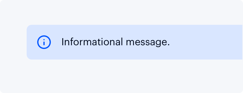
- Spacious components, such as form feedback alerts, use larger 24px icons.
- Meaningful icons used on their own, particularly in the icon-only button, use the largest 32px icon.
Optionally, place icons inline where they match the size and color of the text. This can result in icons that do not conform to the standard sizes below, but close alignment with the adjacent text is acceptable.
Size Tokens
| Name | Value |
|---|---|
|
|
16px |
|
|
20px |
|
|
24px |
|
|
32px |
Accessibility


